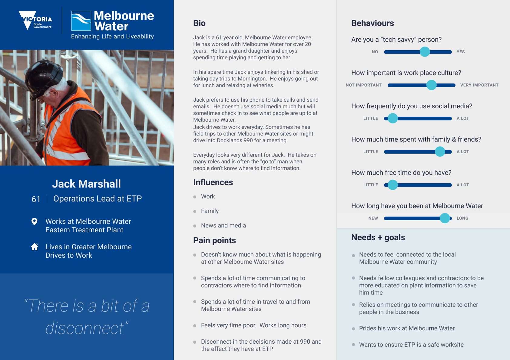
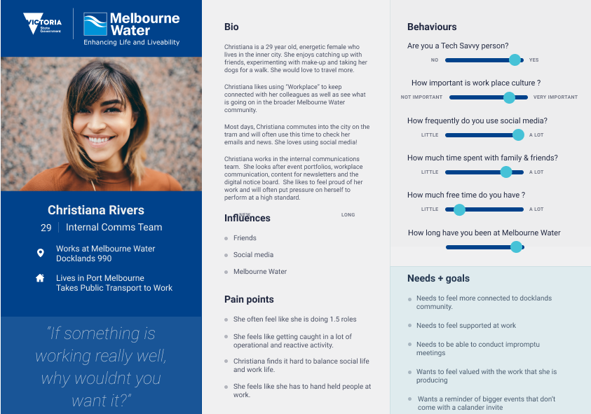
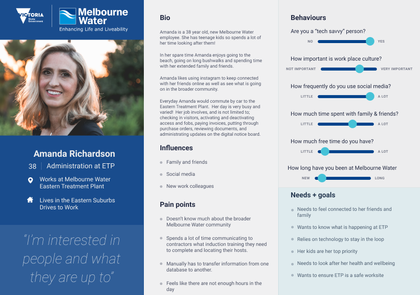
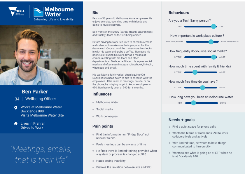
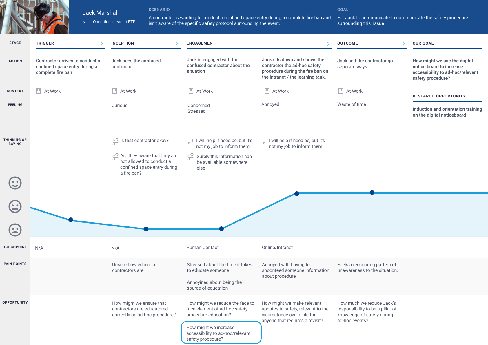
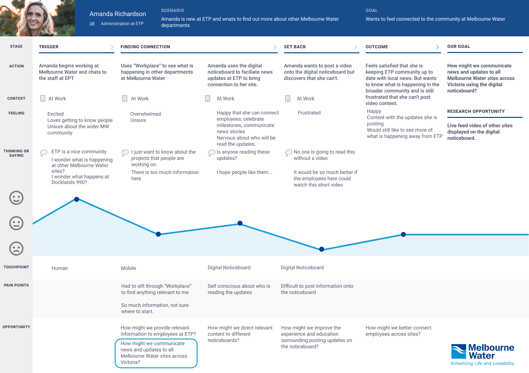
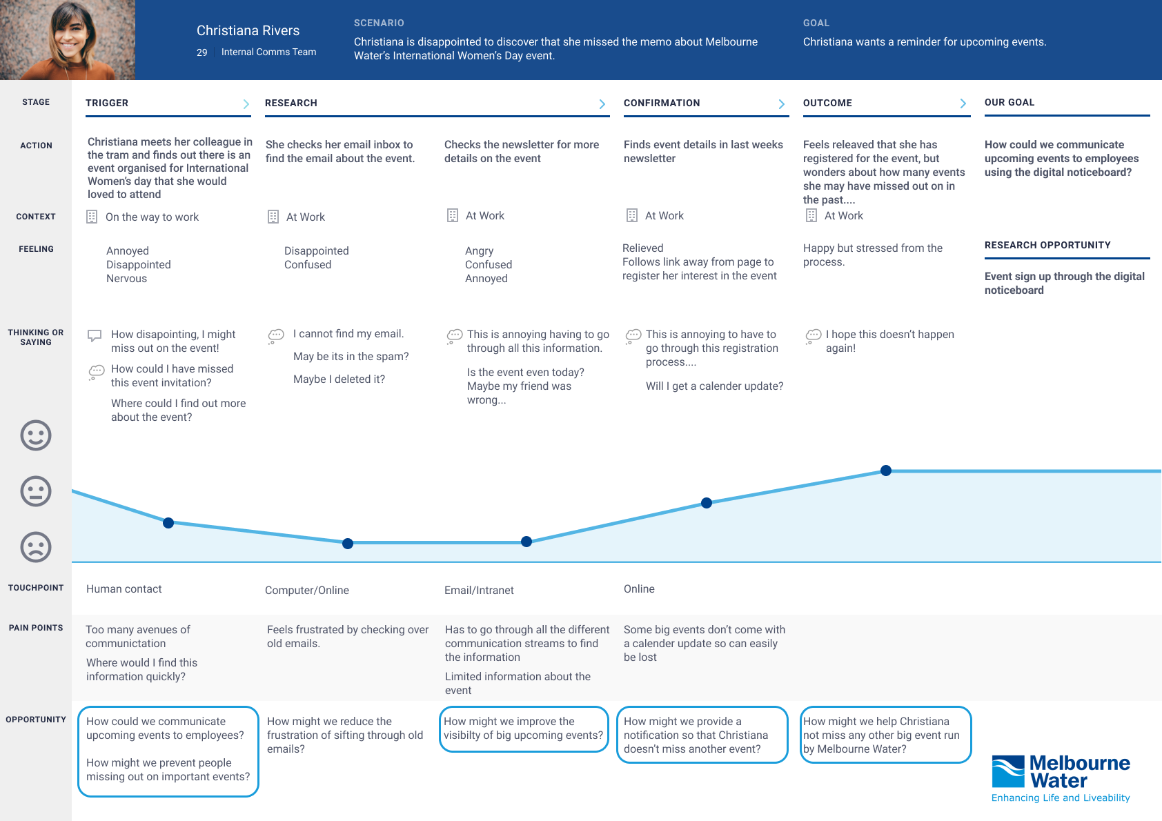
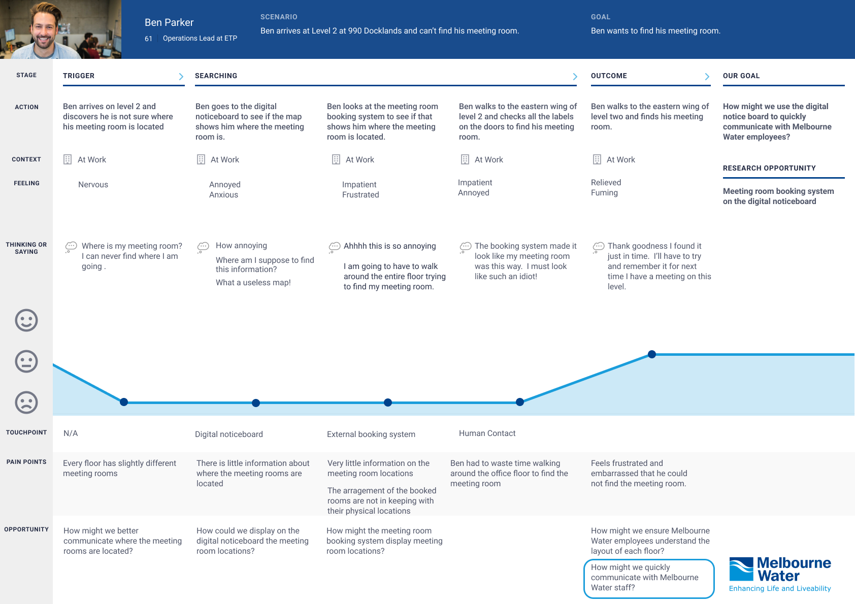
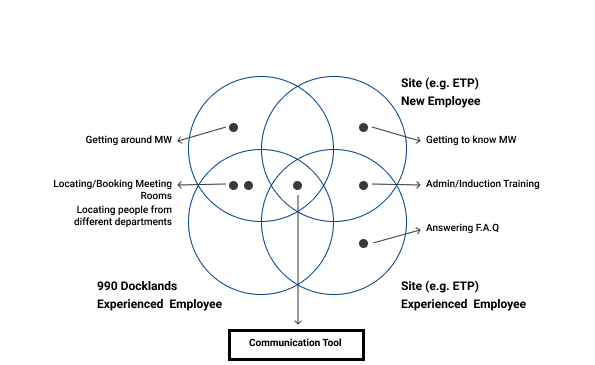
Melbourne Water

Digital Noticeboard

"Melbourne water" is a Victoria owned water systems in Melbourne.

During my time at Academy Xi, we worked closely with Safety, Health, Environment and Quality(SHEQ) teams to improve the screens of digital noticeboard and the experience with the goal of providing valuable information to the employees.

Our Objective

Our goal was to find what information is relevant to the employees and also improve the digital noticeboard Interface, so that employees get engaged with the noticeboard.

The Team/My role

Our team consisted of three UX Designers. We were needed to conduct various types of research to identify the customer group and the problem we needed to solve.

I was involved in all stages of the UX process but more in Contextual Inquiries, Wireframing, Prototyping and iterating through Usability Testing. 

How might we increase the engagement of employees with digital noticeboard?

Our Process

Research

One on One interviews @990 Docklands

75%
of people would like to see events, campaigns, training & MW updates.

"Updates from leaders and strategic"

"This is happening today"

"Reminders for bigger events that I don't get calendar invites for"

"It could be a good platform…to share various innovative things that we're doing around the place..."

"Sharing with other areas of the business"

Location

Employees have their back to the bpoards when they are waiting for the lift.

Employees do not naturally walk past the noticeboards.

Digital noticeboards are located on the back wall of the kitchenette.
Potential missed oppurtunity.

Currently located in an exposed area.
People might feel self conscious in this space.

Interface

33.3%
of people would like to see dynamic content.

"Engagement would look different on every level".

46.6%
of people had issues with the current user interface.

"Cannot read the text"

"Click here" didn't work

"Too much information"

23%
of people would like to see Melbourne Water updates.

"I'd like to see upcoming events."

Education

40%
people had not interacted with the digital noticeboards at all.

"I've noticed the boards, but I haven't used them."

"I haven't really looked at it."

"I don't go past it because I walk the other way."

Content

5/30
people wanted to search the noticeboard to find a colleague.

"I'd like to see information about meeting rooms"

"I'd like a map of the meeting rooms"

5/30
people wanted to see it used for meeting room bookings.

"Would be awesome if you could type in someone's name and find out where they were sitting"

50/50
people wanted to see tram timetable.

"Trams are great, what a good idea!"

"Worried tram timetable is wrong"

Personas

New and Senior employees at ETP and 990.

"New" is described as an employee who has been working less than 12months in Melbourne Water.

A persona is a fictional character created from our research. These characters represent different employee needs, experiences, behaviours and motivations..

Journey Maps

Pain points of Amanda, Ben, Jack, Christiana.

Pain points for employees at 990 Dockland.

Employees were unaware of the events happening in Melbourne Water and they felt disappointed for missing out some of the events.
"I would like reminders for bigger events that I don't get calendar invites for any events."

Employees were frustrated as they couldn't locate free meeting rooms, hot desks or colleagues.
"One of the main pain point I think. To be able to find an empty meeting room."

Opportunity
- To connect people with a communication tool.
- Communicate to employees where they can locate free meeting rooms, hot desks.

Pain points for employees at Eastern Treatment Plan.

Employees were unaware of the updates of Melbourne Water broader community.
"I would like to see the people where they are upto."

Employees were frustrated as they couldn't complete their tasks due to Orientations.
"I have to take time out to do the Orientation which kills all my other tasks."

Opportunity
- To connect people with a communication tool.
- Communicate to employees where they can locate free meeting rooms, hot desks.

Insights

Focusing our insights and themes to produce one key deliverable.

Key insights


- By making changes to 990’s digital notice board, it would reach the largest population of employees and have the biggest effect.

- We had easy access to 990 Docklands employees for testing and good understanding on the needs of 990 employees.


Prioritizing the information


Before creating our low fidelity prototype we did a card sorting activity with employees at Melbourne Water. This was completed in group workshops and was to learn how our ‘Cristiana's’ and ‘Ben’s’ sort, group and prioritize information. This information then informed us on how to design the homepage for the digital notice boards..

Prototypes

Journey of wireframing to mockups.

The Big Idea

User Testing


We iterated our design three times to reflect the feedback we received from Melbourne Water employees.

The feedback validated our research of employees wanting to see internal communications, news and updates, and validated our features such as transport, QR codes and ‘dogs on floor’.

Feedback helped shape our design by tweaking small things such as language, buttons and visual hierarchy.

Feedback from User Testing and steps taken


Language

There was a lot of confusion about where the ‘Map Shortcuts’ button would take employees.

“Maybe you could change the wording here [pointing to ‘Map Shortcuts’]”

“Maybe it could be view map shortcuts”

“Could relabel as 'Floor information'”

“Are you talking about maps? (Confused)”


Remediation

‘Map Shortcuts’ button was renamed to ‘Find on Floor’.

In the last iteration of testing, ‘Find on Floor’ was the most relevant.

Testers were able to navigate here to find map elements.


QR Code

Employees wanted the ability to read articles later on their own devices, however QR codes were not as commonly used as we assumed.

“What is a QR code?”

“I haven't used QR code much but I have seen people using them a lot.”


Remediation

In the last iteration we added an information icon, when clicked it described how to use a QR code. This ensured all employees would be able to take the article they saw on the notice boards to read later.

“I like that you have a scan to read more because sometimes you don't want to stand there at the screen, you might just want to take that away with you.”

Result from User Testing


5/5 of employees successfully navigated the dashboard and could find all the items we asked of them.

5/5 of employees had postive feedback for the new notice board layout and format.

“Everything has it's own little section now which is so much better than the current layout”


"It is a much better layout than before"
- Scott, SHEQ manager

Notice Board Walkthrough

Conclusion

Final take-aways and next steps for Melbourne Water.

Research

Through our contextual enquiries we found employees have their back to the boards when they are waiting for the lift and they do not naturally walk past the notice boards. Research into the ideal location of the notice boards is advised. This could include looking into fun wayfinding techniques such as footsteps from the elevator to the noticeboards.


Awareness

The employees who are in charge of updating the items on the noticeboard need to be trained and educated in how to upload content onto the boards. Our interviews revealed that a limited number of staff were able to do this. Furthermore a discussion on who owns, runs and manages the board needs to be had to ensure content is updated regularly.


Time Management

In a 10 day sprint time management was the key to success. By ensuring my team was time boxing tasks and meeting deadlines we were able to work in a relatively stress free environment which gave us the space to think more creatively.

CONTACT